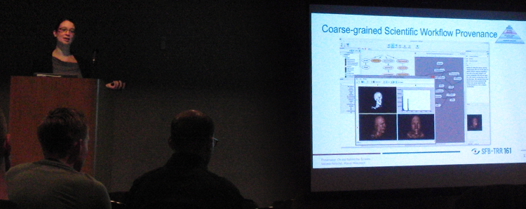
At the beginning of July Melanie Herschel and I gave a tutorial at this year’s ACM SIGMOD conference in San Francisco. ACM SIGMOD is one of the important conferences in the field of data engineering and management. Our tutorial with the title “Provenance: On and Behind the Screens” covered the two topics provenance and visualization, and discussed how provenance information can be visualized.
Provenance Information and Its Usage
The first part of the tutorial was given by Melanie and provided an overview on provenance information and its usage. Provenance information describes the production process of an end product. This can be anything from a piece of data to a physical object (food, chemical compound, business report, etc.). Provenance information allows to assess quality, ensure reproducibility, or reinforce trust in products or data.
There are different types of provenance information:
- Provenance meta-data is the most general type of provenance data and occur in the context of any process type.
- A more specific type of provenance information is information system provenance, which occurs in the context of information systems and respective processes.
- The tutorial focused especially on workflow provenance and data provenance, which are more specific types of information system provenance. The first type provides information how a workflow was created and changed. The second type allows to track the processing of individual data items, e.g., tuples in data bases.

The tutorial showed how to process and use these types of provenance information.
Visualization Concepts to Represent and Understand Provenance Data
In many cases, visualization is required to enable an effective analysis and usage of data and information. This also applies to provenance information. Therefore, the second part of the tutorial was dedicated to visualization and was given by me. Considering the scope of the conference, it was not expected that the audience has prior knowledge on this topic. The second part therefore started with a general introduction to visualization. Basic concepts and issues were discussed, e.g., different types of graph visualizations and issues when using colors. The goal was to provide an overview on different visualization concepts that might be used to represent provenance information. This was further exemplified with two examples of provenance visualizations. The presented methods show different aspects of workflow provenance and allow to analyze how a workflow was changed over time.
The tutorial was closed with a discussion of open research issues and possible future work.
Considering that the tutorial was early in the morning on the last day of the conference, with several other workshop and tutorial presentations held in parallel, there were still many interested people in the audience. Although we overrun the time for our tutorial a little bit, most people stayed until the end and showed their interest by asking questions afterwards. Therefore, I think that our tutorial was a success and hopefully inspired some attendees to work with provenance and create suitable visualizations for their data. It would be really nice to see some cooperation between the database and visualization community in the future.
