
Many applications exist that deal with relations, between people in a social network, between functions in a software system, or between cities in a transportation network. Typically, such relations are not static, but they are changing more or less frequently over time. This means the social contacts of people may differ from time to time, the function calls may change if new components are implemented, or routes may be blocked due to traffic jams or bad weather conditions.
Getting an overview about the dynamics in relational data is a challenging task. The reason for that is the complexity of the data that consists of several data dimensions like the objects that are related, the relations with their strengths, and also the temporal aspect in the data. In graph visualization these terms are denoted by vertices, edges, and time.
Designing an effective and intuitive visualization for such time-varying graph data is difficult since all of the three data dimensions should be reflected in the visual encoding supporting a graph analyst to easily detect visual patterns that can be remapped to the data patterns. Only by this strategy a dynamic graph visualization becomes useful to relaibly do graph data analysis supported by visual means.
To reach this goal, a visually scalable representation has to be designed in order to support the data analyst right from the beginning and to derive visual patterns. Such an overview can be helpful to find a starting point for further data exploration tasks, i.e., after a starting point is found, hypotheses about the data might be build, confirmed, refined, or even rejected. Interaction techniques play a crucial role and might be applied in any of the data dimensions like vertices, edges, and time periods to dig deeper in the data until details are found.
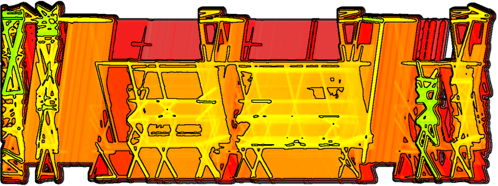
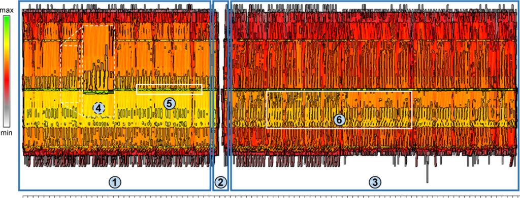
A visually scalable dynamic graph visualization that serves as an overview is presented in the article “Visualizing a Sequence of a Thousand Graphs (or Even More)” in which the novel concept of interleaving is applied. Each graph in a sequence is made artificially bipartite while the vertices are aligned at common vertical axes. This helps to preserve the viewers’ mental map and to reliably do comparison tasks over longer time spans. Melting the individual graphs horizontally generates visual clutter on the one hand, but if the interleaved dynamic graph visualization is splatted and enhanced by contour lines, the graph analyst obtains a visually scalable static diagram of dynamic data reflecting dynamic patterns. If the graph data is unstructured, an additional hierarchical clustering among the vertices is applicable that further emphasizes evolving graph structures like clusters.
The approach is tested for two different applications. Call graphs in software systems during runtime as well as flight traffic data in the US produce long graph sequences with many vertices and directed weighted edges.
Reference:
Burch, Michael; Hlawatsch, Marcel; Weiskopf, Daniel: Visualizing a Sequence of a Thousand Graphs (or Even More). Computer Graphics Forum 36 (3), S. 261–271 (2017).